EcoCrunch Identity
CLIENT
EcoCrunch
YEAR
2026
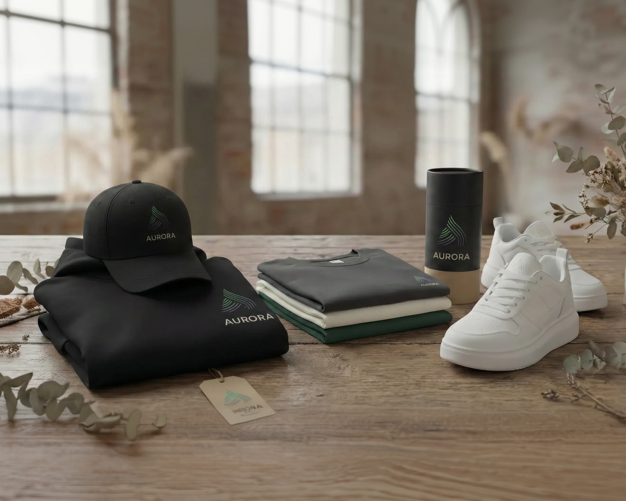
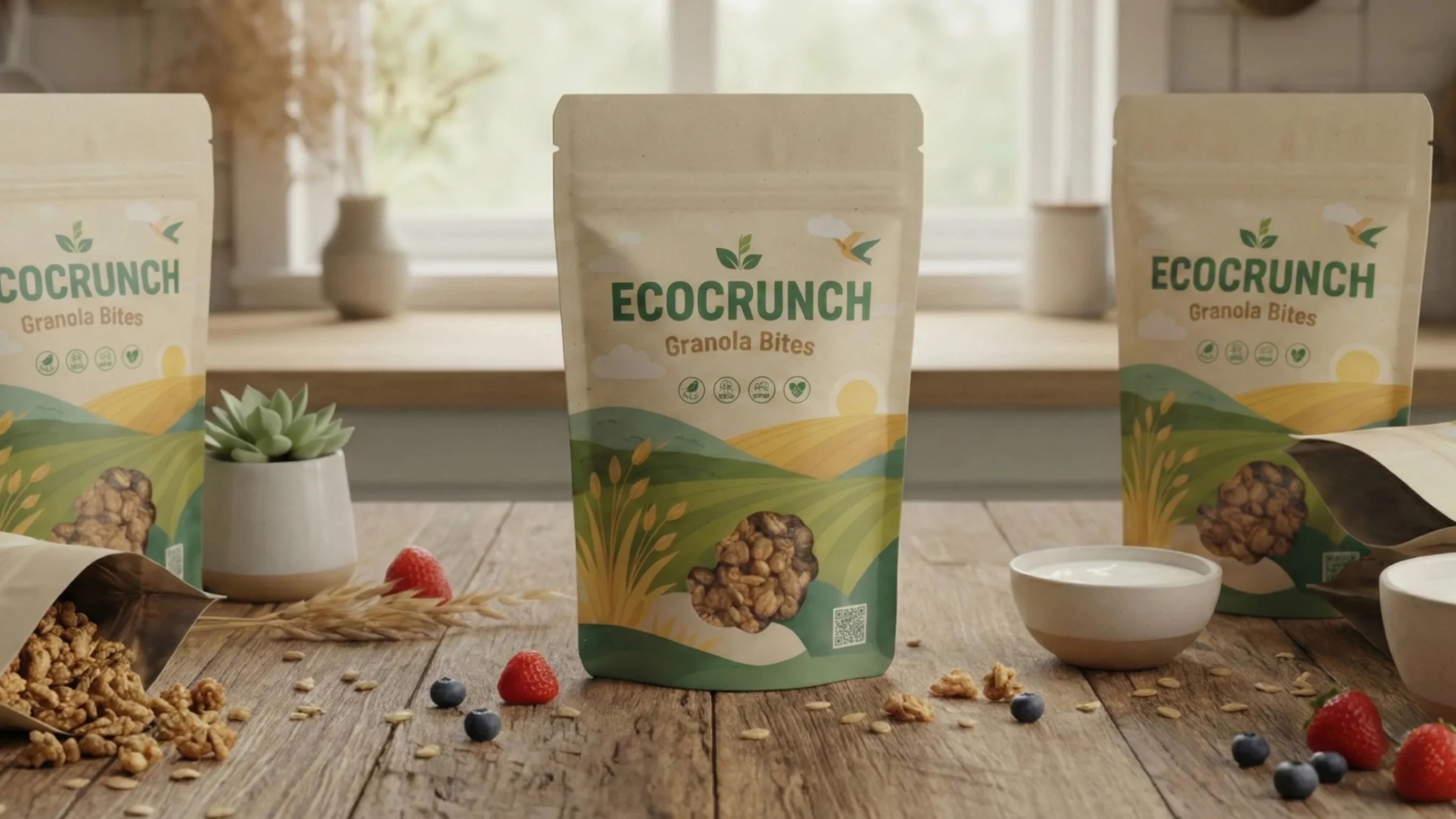
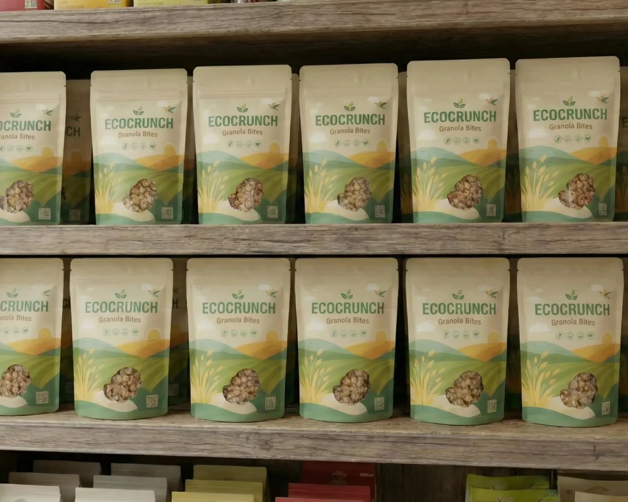
EcoCrunch, a brand specializing in organic snacks, needed a complete brand overhaul. I developed an identity system rooted in warmth and nature, applying it across the packaging to emphasize their commitment to sustainability and quality.
PROJECT TYPE
Direct Client Contract
INDUSTRY
Food & CPG
MY SERVICES
Brand Identity
Packaging Design
Art Direction
TOOLS USED
Adobe Illustrator
Adobe Photoshop
Adobe Indesign
The Challenge
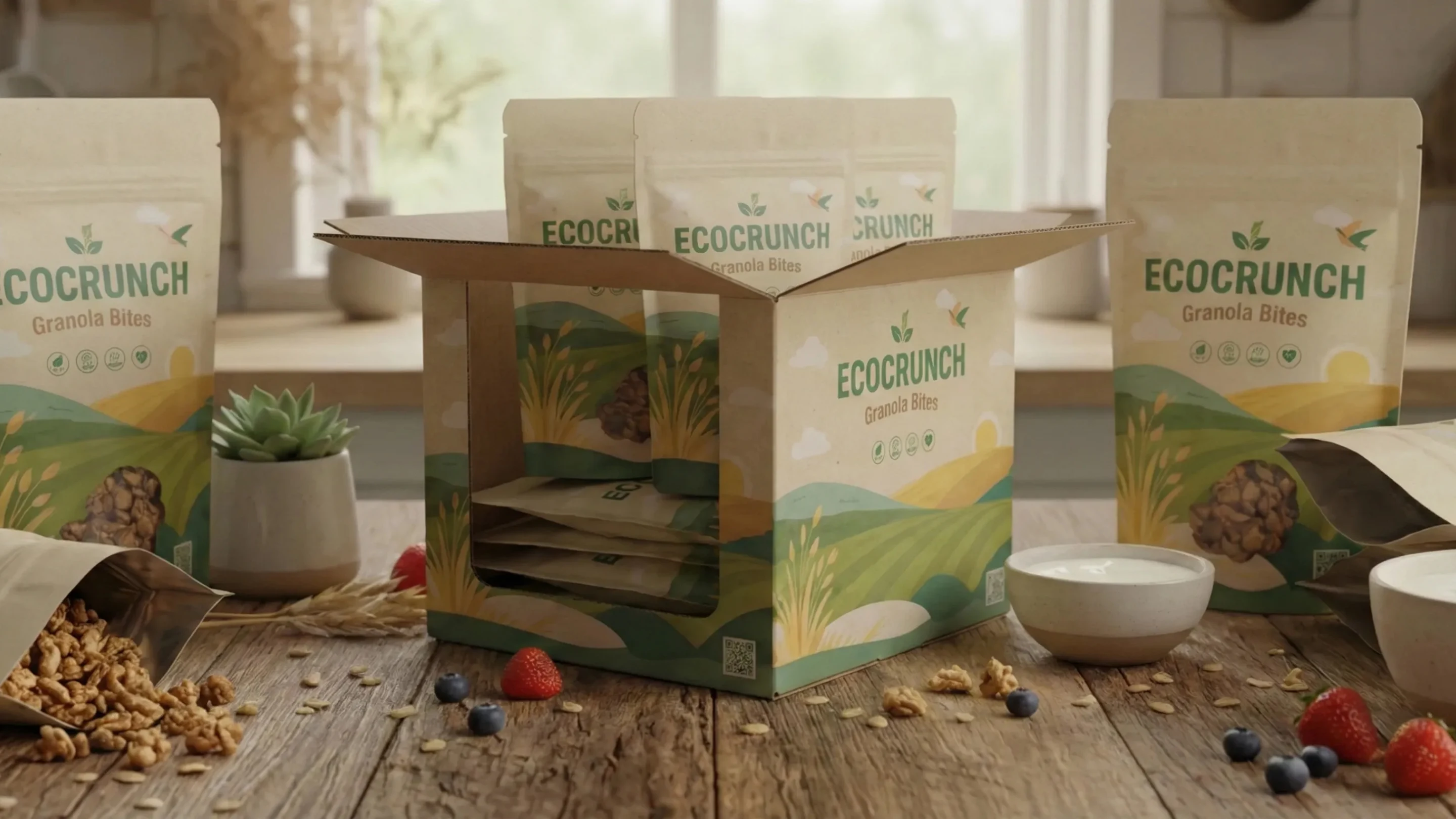
EcoCrunch needed to transition from a generic, low-visibility product to a premium, shelf-defining brand. The key challenge was translating their core values of organic sourcing and sustainability into a visual identity that felt authentic and trustworthy to health-conscious consumers.
The Solution
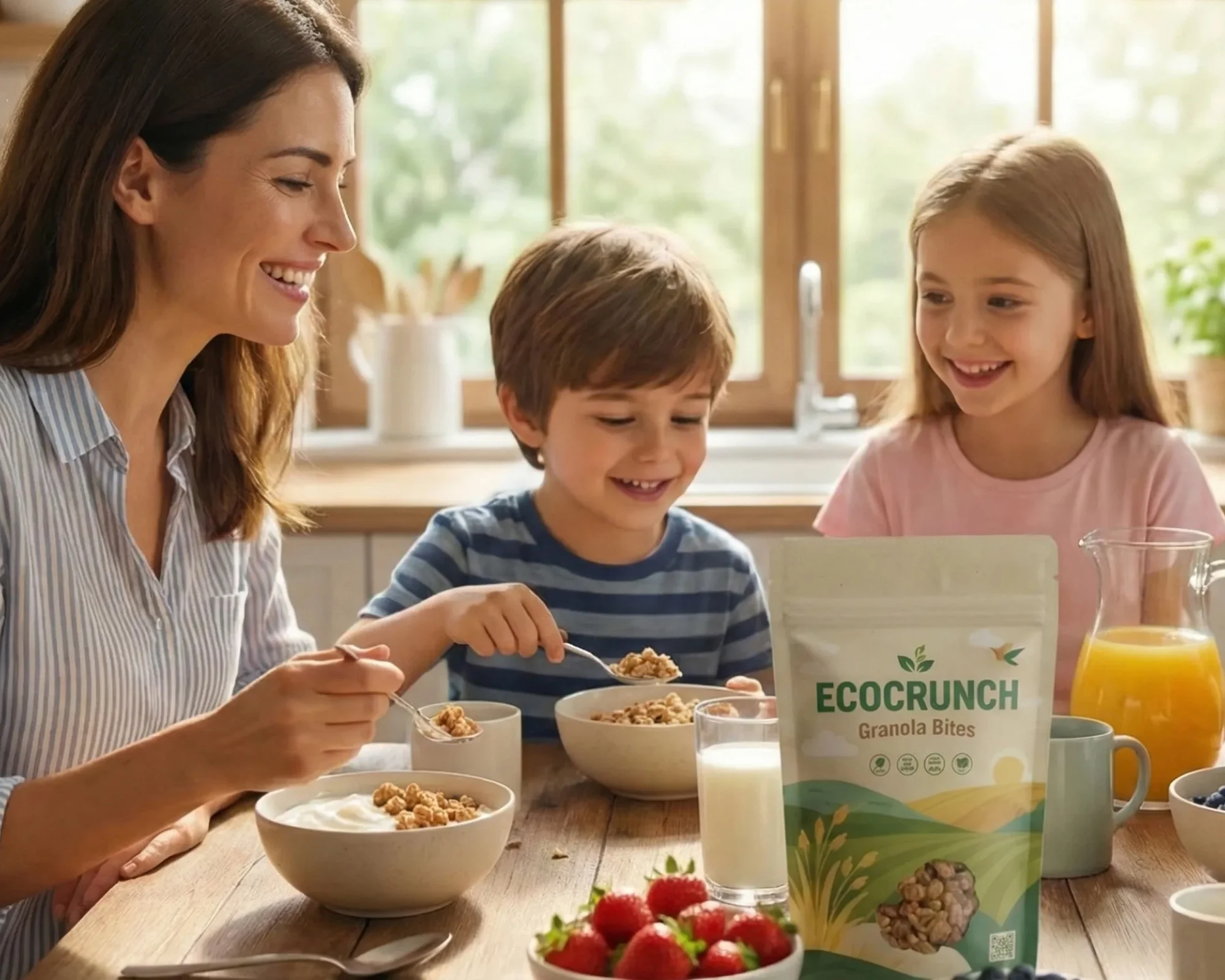
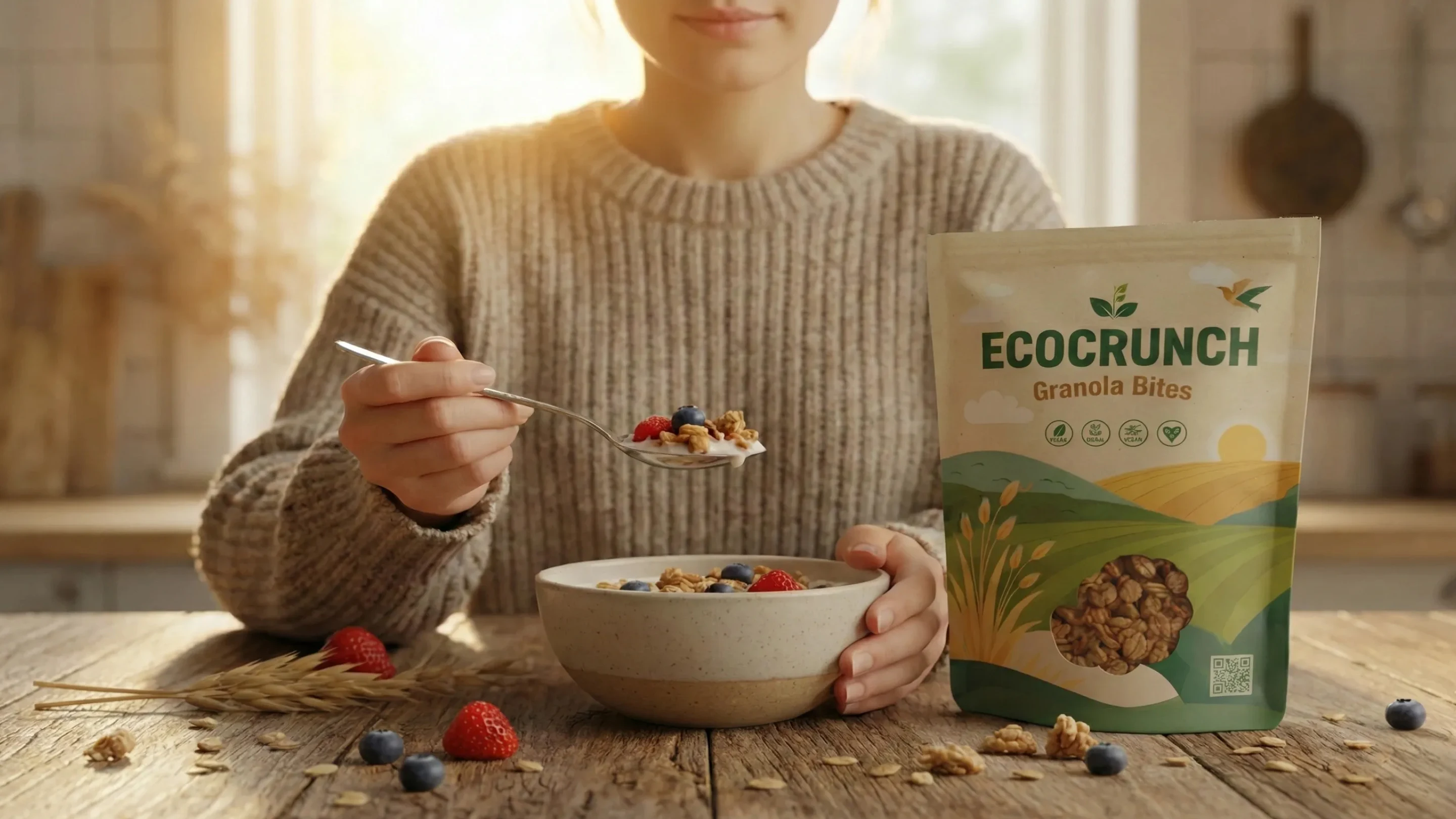
I established a warm, muted color palette and developed a friendly, hand-drawn illustration style for the packaging. This was integrated into a simple, highly scannable packaging layout. I then provided Art Direction for the launch photography to ensure the final product felt honest, natural, and appealing.
The Result
The EcoCrunch Identity successfully elevated the brand's perception, allowing them to expand into high-end organic retailers. The clean, authentic packaging visuals drove consumer trust and significantly increased first-time purchases. The new design system is easily scalable for future flavor expansion.